An imageless web
A picture says a thousand words. Since I recently installed Next Browser on my Android device, I know no picture can say a thousand words too. Browsing with images disabled is pretty worthless. It’s up to us developers to make the best of it.
I installed Next Browser because I read I could prevent images from loading when not connected to wifi. It seemed like a reasonable thing to do, as it speeds up loading times and it saves lots of bandwidth. But once I got out on the internet a lot of websites didn’t seem to make sense: missing gradients, low (or no) contrast and some pages completely collapse because no explicit width and height were set on the missing images. So usability is at stake here. Let’s try to fix that.
What goes wrong when images are disabled
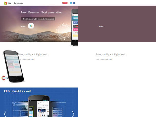
As stated before: some webpages completely collapse or become unusable when images are not visible. Ironically, Next Browser’s homepage is an example of that. Besides the fact that it’s not responsive it has no fallback colors for the huge background images, which results in unreadable pieces of text.

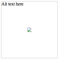
I created a test on JSFiddle to see how browsers behave when images are disabled or missing (that’s the same when it comes to document layout). See the results on CodePen browser behaviour on empty images.
What I find quite interesting about this test is that Firefox doesn’t keep the image dimensions, even though they are present in the image tag. The default browser in Android 4+ is even worse: it doesn’t show a single thing: no alt description and no border. But the majority of browsers are very good citizens: keeping image dimensions, showing a border as an image outline and showing the alt text within that border.

Fixing broken images
The easiest and most obvious solution is, of course, to make sure that every image url works. But sometimes you’re not in the position to do this, as images on the web might ‘disappear’ or move without notice. The best solution is to apply some basic styles to the img tag.
img {
	/* a small font-size to try to keep the text within the original boundaries */
	font-size: 0.5rem;
	/* prevent a bold text as this tends to take up more space than regular font-weights */
	font-weight: 400;
	/* Squeeze lines together */
	line-height: 1.1;
	/* If it's still too large: hide it */
	overflow: hidden;
}
The main disadvantage of this is that paddings, borders, margins etcetera are relative to the font-size that the image has, so it’s important to keep that in mind when working with this approach. You could skip this step, but make sure to provide a useful, readable fallback for the alt text when the image is broken.
While this probably not a design pattern that you and I will probably use a lot, I think it might turn out to be quite useful when you’re not in control of your website’s imagery.