Working with a styleguide
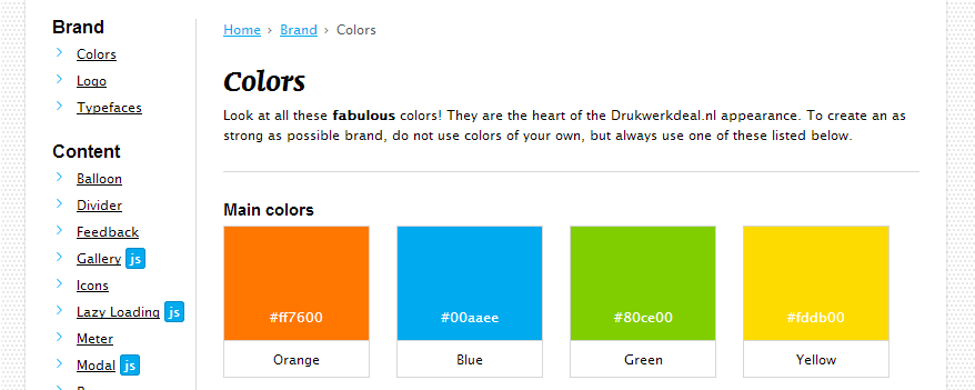
A style guide is a great reference for creating an online platform. At Printdeal.com we’re currently working on a complete new platform, based on frameworks and infrastructures like Symphony2 and the Amazon AWS cloud. Luckily, we’re not neglecting the frontend. Responsive, performance and architecture: we got it all! And all of this based on a single thing: the Style Guide.

The main goals
There are many arguments to create and actively use a style guide when working on a (responsive) website:
-
Reference guide
The pattern library will always be a central point for developers working with the responsive project to look up what that object was called that vertically aligns two elements. He'll quickly see that it's the Flag object and how it should be implemented.
-
Shared terminology
Whether you're a designer, a developer, Product Owner or a member of the Management Team: if all people use the same names for the same stuff, communication will go a lot smoother. Less mistakes equals less time to develop equals more time to work on other items.
-
More reliable task estimates
When developers and designers use a pattern library as a starting point for a task, they can agree on what elements they can reuse and therefore come up with more reliable task estimates.
-
More focus on multidisciplinary aspect
As the whole multidisciplinary team will be responsible for maintaining a solid pattern library, it will become a shared effort instead of each discipline working in it's own field.
-
Reference for stakeholders
Stakeholders (e.g. Marketeers, Managers) can browse through the pattern library and see if an item they want can be created with little effort, or that a larger effort is needed because it does not exist yet. It's about managing expectations.
-
The company as a knowledge institute
A well designed pattern library can be a real showpiece towards clients or future employees (or anyone who's interested, for that matter). People can see you take your job very seriously and even that you're doing a good job. See some real world examples:
-
Quick start for new collegues
When you've welcomed a new member to the team it's nice just to show him/her the library and let him/her browse around for a while to get a feeling with the project and the company.
Where to start
Creating a responsive, well structured frontend for a company like Printdeal.com is daunting, because the company relies heavily on graphics, images and colors and especially the first two do not scale well performance wise. The difficulty with all these parts is creating a base from which parts can be used, reused and extended. Think of it as Lego: start with tiny blocks, expand and create whatever you like.
Using proper techniques
We found some key concepts that helped us achieving our goals: BEM, OOCSS and Inuit . Having solid naming conventions (BEM), code standards (OOCSS) and (parts of) an incredible framework (Inuit) allows us to take pieces of code, reuse them on other parts and extend them whenever we see fit. These things have been used by many smart people and are very well tested and thought through.
Finding a new workflow
The era of responsive webdesign confronts us with several challenges. As you’ve seen, some can be tackled by clever techniques, but some can’t. Like the design process. Our in–house webdesigner usually creates static mockups and the development team implements these. The problem however is that a responsive website can and could look like anything on any device. Or as Stephen Hay said:
Photoshop. That’s where you make a picture of exactly what the website will never look like.
Therefore, the style guide helps us define and test the small parts. When combining them into the complete website, all should look and work fine.
Be flexible
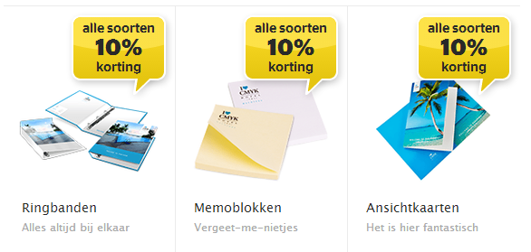
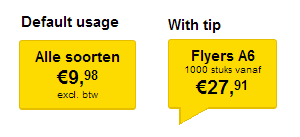
The best thing about having a style guide the way we do, I think, is that you can be 100% flexible. Because all objects have seperate concerns, we can adjust them to our likings and all should be well. Of course this doesn’t always apply, but in most cases it works. For example, our designer Elbert came up with a new design for a balloon element in the site. The new design could very easily be converted to code and even better, we were able to split it into two different objects to create even greater reusability throughout our code.
 The old, visually slightly more complex balloon
 The new balloon, it even comes in two different forms and more flexibility with the elements inside it
Everybody wins
One of our final goals is making the Style Guide a shared effort between the Development, Marketing and Design departments. Having a multidisciplinary User Experience team at Printdeal.com is a great step towards that. It’s never easy, but always completely worth it, because we feel very confident in reaching the goals we set ourselves: Always be impressive!